Eclipse Graphene
Dear Internet,
As I noted in an earlier post, Eclipse on Fedora 22 has some usability problems with the colors it uses. Eclipse uses GTK 3 for a lot of the theming of the interface. With the Gnome Adwaita theme, several of the drop-down dialogs (like Content Assist) have very little contrast between the background and foreground of a selected item. The result is the highlighted text is extremely difficult to read. Your only recourse is to mess with GTK settings.
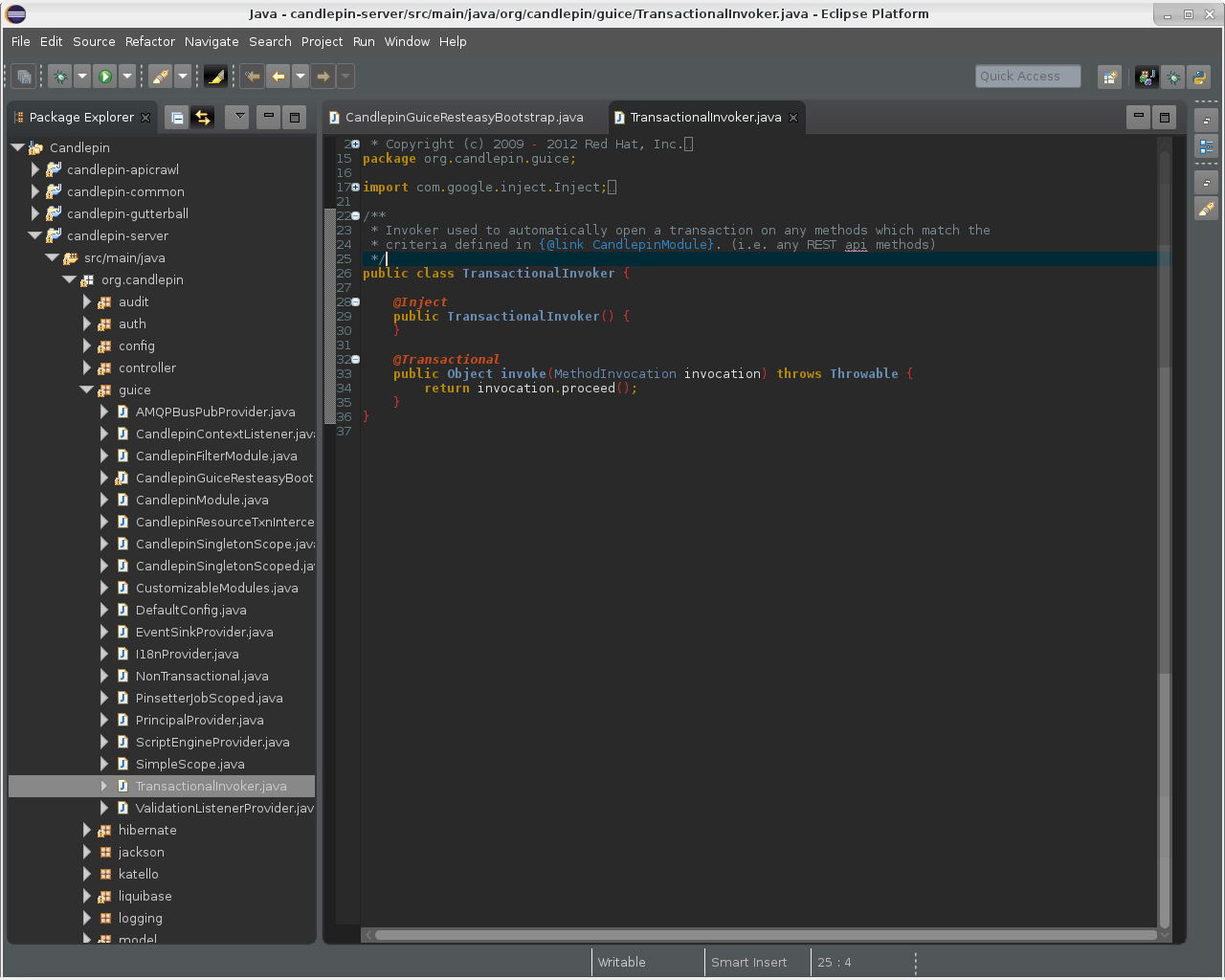
I had managed to address an issue with the Content Assist drop-down only to run into another issue with the Quick Outline drop-down. Finally I gave up and said, "to heck with it, I'm going to redo the whole thing." To check out the result I came up with, head over to the Eclipse Graphene repo.
Here's an example:
